Bypassland
What if an app could help you feel again?

I led end-to-end product design for an early-stage emotional wellness app.
I partnered with domain experts and engineers to create a safe, AI-powered emotional wellness app based on the Kiloby Inquiry (KI) method. KI is a somatically informed approach to accessing and releasing emotions. My job was to turn a human-guided, in-person process into a digital product.
1
Designer (me)
2
Frontend Dev
1
Backend Dev
1
AI Specialist
Problem
KI requires a facilitator and face-to-face interaction. This makes the work expensive and intimidating, especially for beginners.
Goal
Design an AI-powered app that teaches the method, guides emotional processing sessions, and tracks psychological patterns over time.
Impact
●
Led 0 → 1 UX strategy and UI design, from concept to development.
●
Ran workshops that aligned stakeholders on a shared product vision, turning abstract ideas into a concrete UX strategy.
●
Produced design specs and an asset library to guide initial build and support future iterations.
●
Earned strong validation from facilitators and product owners, advancing the project to the next stage.
Discover
To understand KI, I talked to experts, read books, and watched real KI sessions.
I analyzed engagement data from KI's existing platform to identify friction points, then used qualitative methods to understand the practice:

I spoke directly to KI mentors and practitioners.

Read several books: from official KI material to their recommended readings.

Watched hours of recorded sessions between facilitators and practitioners.
Who is this app for?
Newcomers to KI
Pain Points
Unsure how to start or what to say to the AI
Emotional vulnerability without a human guide
Lack of motivation or clarity about progress
Opportunities
Provide suggested first messages for sessions to make getting started easier
Offer reassurance in a friendly tone
Use gamification to encourage progress
Seasoned Practitioners
Pain Points
Difficulty maintaining a regular practice alone
Stagnation, feeling like sessions are repetitive
May feel dependent on a facilitator
Opportunities
Let users revisit psychological patterns they discovered during sessions
Summaries, insights, and progress tracking
Build self-confidence to reduce reliance on facilitators
develop
At first, we envisioned the product as a journaling app that helped users process repressed emotions.


test
User testing revealed that the experience felt too ‘on-rails,' so we pivoted.
Once a highlight was selected, the flow repeated a nearly identical template each time, which made interactions feel mechanical. To address this, we brought in an AI specialist and shifted from a journal-based to a conversational model.

On the left: an early low-fidelity wireframe from the journal-based version. On the right: a high-fidelity mockup of the conversational AI interface.
define (again)
I created a new user journey to clarify each stage of the experience and how to support users with conversational AI.

The pivot brought new challenges.
●
Traditional AI chat interfaces require thinking and verbalizing, which pulls users away from their direct, emotional experience.
●
Conversational UIs also come with structural limitations. Unlike spatial GUIs, conversations are linear and offer little guidance about what the system can do.
●
I designed a hybrid interface combining conversational and GUI elements based on these core challenges:
Critical questions to solve through design
How do we make users feel safe doing emotionally sensitive work with an AI?
Emphasize privacy, add an always-available emotional regulation button, and offer access to community and mentors.
How do we reduce the need for typing and verbalization?
Let users begin sessions with one-tap prompts, use affordances to reduce cognitive load, and support text-to-speech.
How do we turn an abstract inner process into actionable UI?
Let users “capture” psychological and emotional patterns as interactive UI elements they can reflect on and build upon.
How do we onboard users into a complex method like KI without overwhelming them?
Create short, spaced-out lessons, introduce complex topics later, and use gamification to boost learning motivation.
develop
One major pain point for KI practitioners was maintaining a consistent practice.
The solution: a dashboard designed to reduce hesitation and reinforce motivation.
Strategy
User Goal
When I open the app, help me see my progress and the next recommended steps, so I can stay motivated and keep practicing.
Design Goal
Design a calm home screen that celebrates progress and makes the next step obvious, whether starting an inquiry or continuing learning.
Risks & Pitfalls
●
If next steps are unclear, motivation is lost.
●
If tracking streaks or daily goals feels trivial, motivation drops.
Impact & Metrics
Defining Success
If this dashboard succeeds, users will know what to do next, feel motivated by their progress, and return consistently to continue their practice.
Measuring Success
●
Number of repeat sessions per week.
●
Higher streak completion (% of users maintaining 3+ day streaks)
●
First-session drop-off in %.
●
Customer Satisfaction Score ≥ 4.5/5 on clarity and motivation
Proposed Solution

Another pain point: practitioners struggled with how to start a session.
As a solution, I designed "entry ramps." These are one-click prompts reflecting different psychological or emotional states people are usually in before a session. My choices were grounded in KI resources and insights from facilitators.

The session screen: the core of the product, what makes or breaks the app.
Strategy
User Goal
When I’m struggling, help me safely understand what I’m feeling so I can uncover hidden emotions, process them, and find relief.
Design Goal
Design a session screen that guides users safely through the KI, provides emotional regulation tools when needed, and captures patterns for future processing sessions.
Risks & Pitfalls
●
If users cannot stay oriented in the process, then they will feel lost and abandon the session.
●
If users cannot regulate when overwhelmed, then they will disengage or be harmed.
●
If users cannot capture and revisit insights, then the practice loses long-term value.
Impact & Metrics
Defining Success
If this screen succeeds, users will process their emotions safely, and the AI will flag and save relevant patterns to revisit later.
Measuring Success
●
Completion rate (by phase).
●
Session drop-off (by phase).
●
CSAT score ≥ 4.5/5 (post-session survey). Also measures how the user feels after a session. Adverse effects should be near zero.
●
De-escalation success: distress successfully flagged by AI + Ground Me used + session completed.
●
Abandonment under distress: % of distressed users who end session before completion.
Proposed Solution

In-Chat Affordances
These are elements that appear in the conversation to reduce friction, offer gentle guidance, and help maintain emotional presence by minimizing the need for typing or decision-making.

Snackbars
Displays notifications without taking up space inside the chat.

Meditation / Rest
Starts a meditation or guided breathing process to regulate the nervous system or ground the user before a session.

Meta Utilities
Text-to-speech, copy, and flag response. They increase user agency without blocking the flow.

Tooltips
KI concepts appear underlined when mentioned by the AI. Hovering reveals definitions.
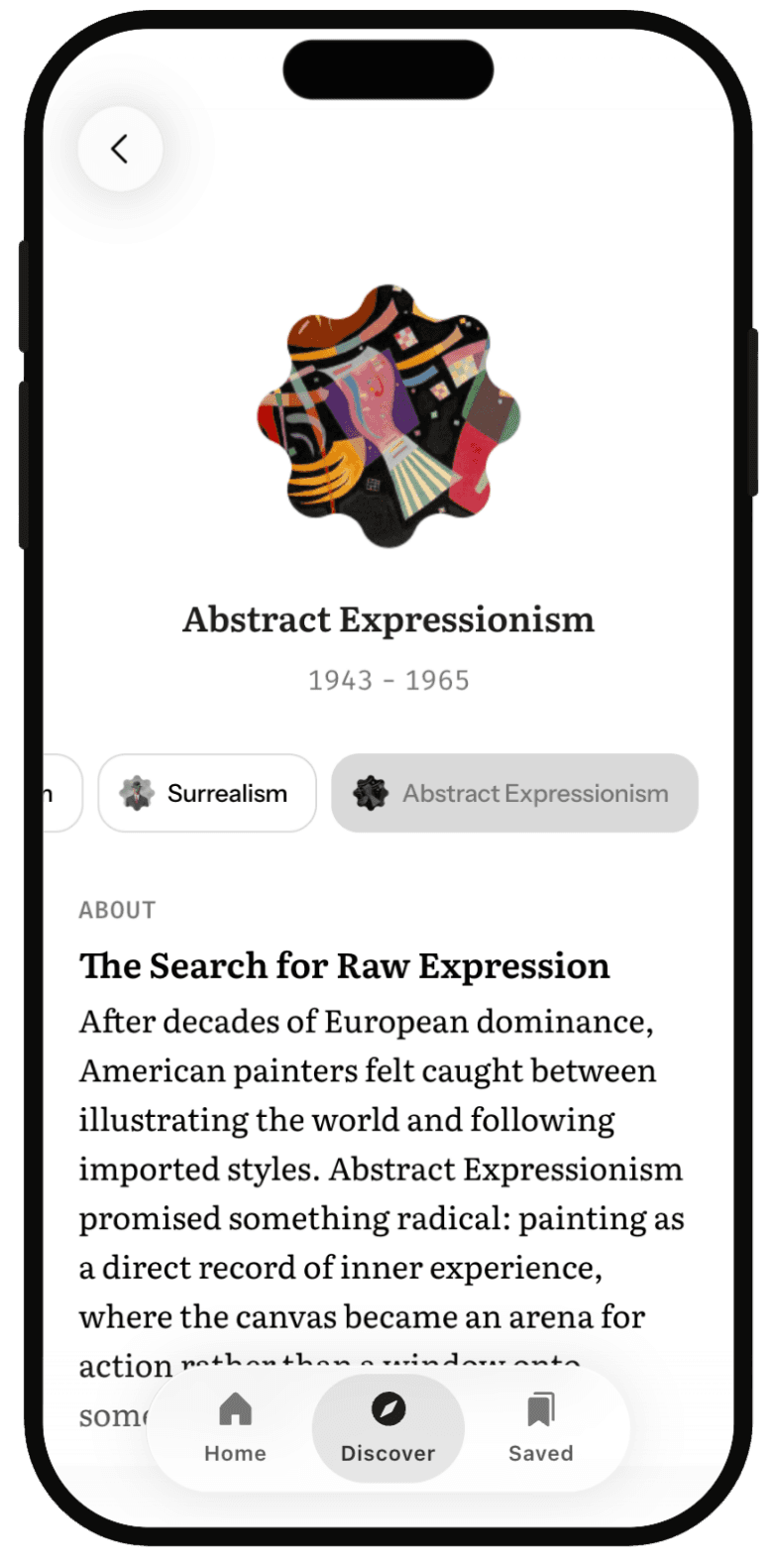
Users may be unfamiliar with KI, so the app needed an educational system.
Each lesson begins with a scripted AI message containing fixed definitions and examples for consistency across users. It then transitions to an open conversation where the AI can answer questions, provide additional examples, or help users explore the topic further.
Strategy
User Goal
When I am new to KI or unsure about a concept, help me learn just enough to practice safely and effectively, so I can progress with confidence.
Design Goal
Provide a focused learning hub that clarifies what KI is, shows the user their level and next lesson, and makes it easy to apply what they learn in real sessions.
Risks & Pitfalls
●
If users feel overwhelmed by jargon, then they will avoid learning and stall out.
●
If next steps are unclear, then momentum is lost.
Impact & Metrics
Defining Success
If this screen succeeds, users know where they are in the curriculum, start and complete short lessons, and apply those lessons in their next sessions.
Measuring Success
●
Lesson start → completion rate.
●
Click-through on “Your next lesson.”
●
Learning CSAT score ≥ 4.5/5.
●
Percent of users who complete the first module.
●
Post-lesson application: percent of sessions within 48 hours that reference the lesson concept or use a related tool.

Users can access a dedicated learning dashboard that shows their current rank (e.g., Apprentice), their next lesson, and a progression path that follows the already established KI curriculum.
Gamification
Drawing from the Octalysis Framework, the goal was to apply motivational psychology in a way that made difficult inner work feel accessible, sustainable, and worth returning to.

Visual map of the Octalysis Framework applied to Bypassland’s feature set.

I created a full gamification strategy brief on our shared Notion workspace that mapped each feature to motivational psychology using the Octalysis Framework. It served as an internal reference for aligning product, design, and development decisions.
deliver
Takeaways
Impact
●
Led 0 → 1 UX strategy and UI design, taking the product from concept to development phase.
●
Led workshops that aligned stakeholders on a shared product vision, turning abstract ideas into a concrete UX strategy.
●
Delivered design specs and an asset library to guide initial build and support future iterations.
●
Built 4 core features: sessions, learning system, pattern-tracking, and gamification strategy, forming the backbone of the product.
●
Earned strong validation from stakeholders, advancing the project to the next stage.
Vision for the Future
●
Gather more user data to refine how and when the AI introduces guidance or tools.
●
Build an adaptive ramp system that adjusts to user history or current emotional state.
●
Expand features like "WeSpace," the social reflection area, and "The Net," a system for tracking recurring psychological patterns and breakthroughs.
To be continued…
More Experimentation is Required
User behavior and LLM responses are unpredictable. Entry ramps, pacing strategies, and affordances require continuous real-world testing and iteration based on actual usage patterns.
Data is Crucial
Observing user behavior in AI-guided sessions is essential for future iterations. Empathetic UX design requires listening, not assuming. Data will reveal new patterns and opportunities for better flows.