Habit Slayer
No more half measures: A habit tracker with teeth

Overview
Challenge Beats Comfort
Sometimes, real transformation isn't Animal Crossing, it's Dark Souls. You need to get good and rise to the challenge.
I conceptualized Habit Slayer for those seeking a challenge. While I feared a tougher app might deter users, I discovered a passionate audience eager for something that pushes them harder.
Problem
Most habit trackers reward users for minimal progress and enable incomplete days to go unnoticed, which can lead to inconsistent habit formation.
Goal
Designing an app that motivates users to strive for higher completion rates by setting a threshold for rewards to encourage accountability and consistency.

Habit Slayer's home screen.
discover
Research
Background Research
I researched the potential effects of a more unforgiving habit tracker. Initially, I considered a “souls-like” habit tracker, which meant users would lose all experience points (XP) for failing a day but could regain them by completing most habits the next day. This was scrapped because the background research revealed that it would not only disengage users, but it wasn’t effective for building consistent habits. A better version of the concept was developed instead.
Interviews
I interviewed three people:
●
Erico, a gamer with ADHD who struggles with consistency.
Julia, a freelancer who struggles with structure because she works from home on her own schedule.
●
Diego, who spends way too much time “decompressing” after work, and not enough time working towards his goals.

Image used with consent from the interviewee.
What they said
Research-Based Personas
I created two user personas based on the interviews I conducted and data collected from the background research.


Scoping out the competition
I researched similar apps and created a competitive matrix to understand the current market landscape.


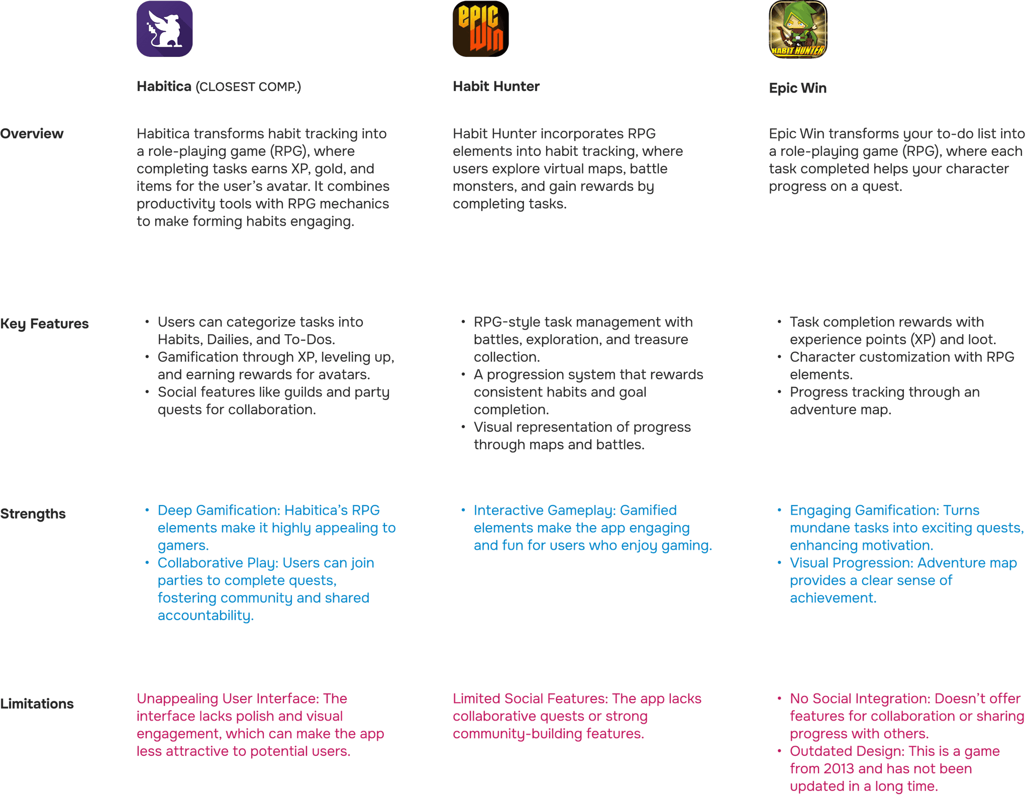
Opportunities For Differentiation
Stricter Reward System
Users must complete a set percentage of goals to earn rewards, promoting higher completion rates.
Incremental Rewards
Partial rewards at 33% and 66%, plus full rewards at level completion, keeps users motivated all day.
Clan Quests
Group quests with friends add a social dimension that neither Finch nor Habit Hunter fully addresses.
defining
Conceptualzing
Brainstorming
A wide range of ideas were considered before narrowing down to the most impactful and feasible concepts.
The original scope was too large. It involved exploring an open world, raids, and ranked competition. The latter was scrapped because cheating by marking goals as completed was too easy.
After considering what would serve my users best, I laid out a unique value proposition that addressed my persona’s needs and frustrations.


Value Proposition
Real-world goals are framed as RPG quests for users to complete daily.
Users earn experience points (XP) for completed goals, and level up at user-set thresholds (50-100% completion)
Users must complete a set percentage of goals to earn rewards, driving higher achievement.
Users can join friends on team quests for shared motivation and accountability.
User Flows
I created user flows and task flows for many actions the user can perform.
High Level Onboarding
High-level user flow for the onboarding process.

Mark Habit as Done Task Flow
Task flow for marking a habit as done and therefore being rewarded with currency.

Buy Equipment Task Flow
Users can use the currency they gain by completing habits to buy equipment.

develop
Designing the App
The Interface
I started with crude paper wireframes to brainstorm what the app would look like and get a feel for it. Then I drew them in Figma.

Testing
First Round of Testing
Once I had low-fidelity prototypes ready, I conducted one moderated and three unmoderated usability tests. Participants were tasked with completing the onboarding process, and then interviewed on their knowledge of how the leveling system worked.
Since this is the core mechanic behind the gamification of the app and the main differentiator from the competition, users needed to understand exactly how it worked. After that, users were tasked with creating a new habit from the home screen. Once the tests were done, I collected the data and used affinity diagrams to synthesize a few observations:
4/4 found it easy to use the app.
4/4 were able to create a new habit from the home screen.
3/4 understood that they gain XP when they complete a goal / slay a monster.
Second and Third Round of Testing
After the first round of testing, it was clear that my approach to onboarding failed. Not only was it too long, but a colleague and tester who works in a related field advised that users don’t like to read onboarding, so I made the process shorter and simpler. I saved the details for after users were already using the app, added a progress bar, and made improvements to the copywriting.
The final round of testing validated my new approach and showed that 3/3 testers understood the leveling system.

The onboarding was shortened, and the copywriting improved, resulting in better feedback in the last round of testing.
The Glow Up

Visual Choices
Color
I challenged myself to design an app that made bold use of color. I chose a vibrant color palette to inject fresh energy while preserving the fantasy atmosphere.
The store and equipment pages feature a distinct color palette to create a sense of “place,” making it feel like the player has stepped into a different location compared to the “home” environment of the home and quests screens.
Softer tones were chosen to reduce cognitive load and enhance visual contrast, especially on content-dense screens, while adhering to APCA accessibility standards.
Typography
Headings are set in Lora, an elegant font with storybook charm. It’s perfect for conveying medieval fantasy themes while remaining modern and relatable.
This is offset with Nunito Sans, a clean and readable font. Its rounded, friendly shape pairs well with the softer features of Lora, creating a balance.
Design System
Components feature curved edges and subtle button shadows, creating a friendly, approachable interface while making interactive elements easily recognizable.
The layout is structured around a 16px-based spacing scale, with values adjusted by multiplying or dividing by 0.5 for flexibility.
A design system ensures components and styles are consistent across the app and keeps track of variants. Auto-layout was used where appropriate.
Iconography
Fun and friendly vector-like icons (by MaxIcons) were chosen for prominent icons. They bring a modern touch while keeping things simple and easy to spot.
For secondary icons, I used Font Awesome. They complement the primary icons while maintaining visual hierarchy with their simpler, monochromatic style.
Illustrations
It was tempting to make it look like old-school RPGs by using pixel art graphics. However, vector illustrations were chosen as they provide flexibility, scalability, and a polished look that aligns well with the app’s design goals.
It also sets it apart from competitors who opted for pixel art graphics.

deliver
High-Fi Prototypes
(Press the arrows on the top right corner to see it in full screen.)
App Navigation
Onboarding
Takeaways
Impact
●
Created a scalable design system.
●
Generated 12 screens to create a prototype on Figma.
●
Created several interrelated systems that has the potential to help people form better habits.
Vision for the Future
●
More customization options such as. building a homestead, or a guild hall with clan mates.
●
Visualizing monthly challenges as a journey in which the player moves through different parts of a fantasy world to simulate a journey.
●
Rewarding users with collectible badges for completing streaks, leveling up, or accomplishing specific milestones to boost engagement.
Key Insights
The Importance of Listening to Users
Through research and testing, I learned the importance of engaging with users to understand their needs and frustrations. Testing allowed me to validate my ideas early, ensuring the app would address pain points and provide meaningful solutions.
Balancing Challenge and Accessibility
Designing an app that pushes users while still being flexible and approachable is crucial in striking a balance between accountability and adaptability.
Iterative Ideation is Sometimes Messy but Necessary
The brainstorming and ideation process wasn’t linear, and that’s okay. It taught me that creativity often involves exploring multiple paths, refining ideas, and embracing uncertainty to arrive at the best solution.


