Project Gutenberg Redesign
Redesigning the world's oldest digital library

Overview
Modernizing Gutenberg
In the era of paywalls and digital restrictions, Project Gutenberg stands as a literary lighthouse, offering thousands of timeless books freely to readers worldwide.
Yet this pioneering digital library, the internet's first of its kind, was held back by an interface frozen in time, with outdated navigation and poor mobile accessibility hiding its treasures from modern readers.
Problem
Project Gutenberg's outdated interface obscures its vast literary collection, hindering discovery and engagement.
Goal
To modernize the interface, improve usability, and enhance discoverability while preserving the site’s literary heritage.
The Approach
I applied Object-Oriented UX (OOUX) to break down the platform into core objects like books, genres, collections, and users.
By organizing information around these objects and their relationships, I focused on improving discoverability, usability, and consistency.

Noun Foraging
First, I started with noun foraging, a process where I identified the key objects on the website by listing all the nouns found in the platform (e.g., books, authors, genres, collections). This helped me determine the most important elements to organize and prioritize in the redesign.
A sample of the nouns found in the Project Gutenberg Website
Grouping
Then, I grouped the nouns to identify the main objects of the website, such as books, authors, genres, collections, and users. I separated the nouns into:
Object
Content
Metadata
This step clarified the relationships between objects and laid the foundation for the site’s structure.

Grouping example: Objects related to “books,” categorized into content, metadata, or another object, like “author.”
Relationship Discovery
Next, I created a nested-object matrix, to map out how the main objects—books, authors, genres, collections, and users—interact and relate to one another. This step ensured that the relationships between objects were clear and intuitive for both navigation and organization.
The nested-object matrix helped me understand how the main objects relate to each other.
CTA Discovery
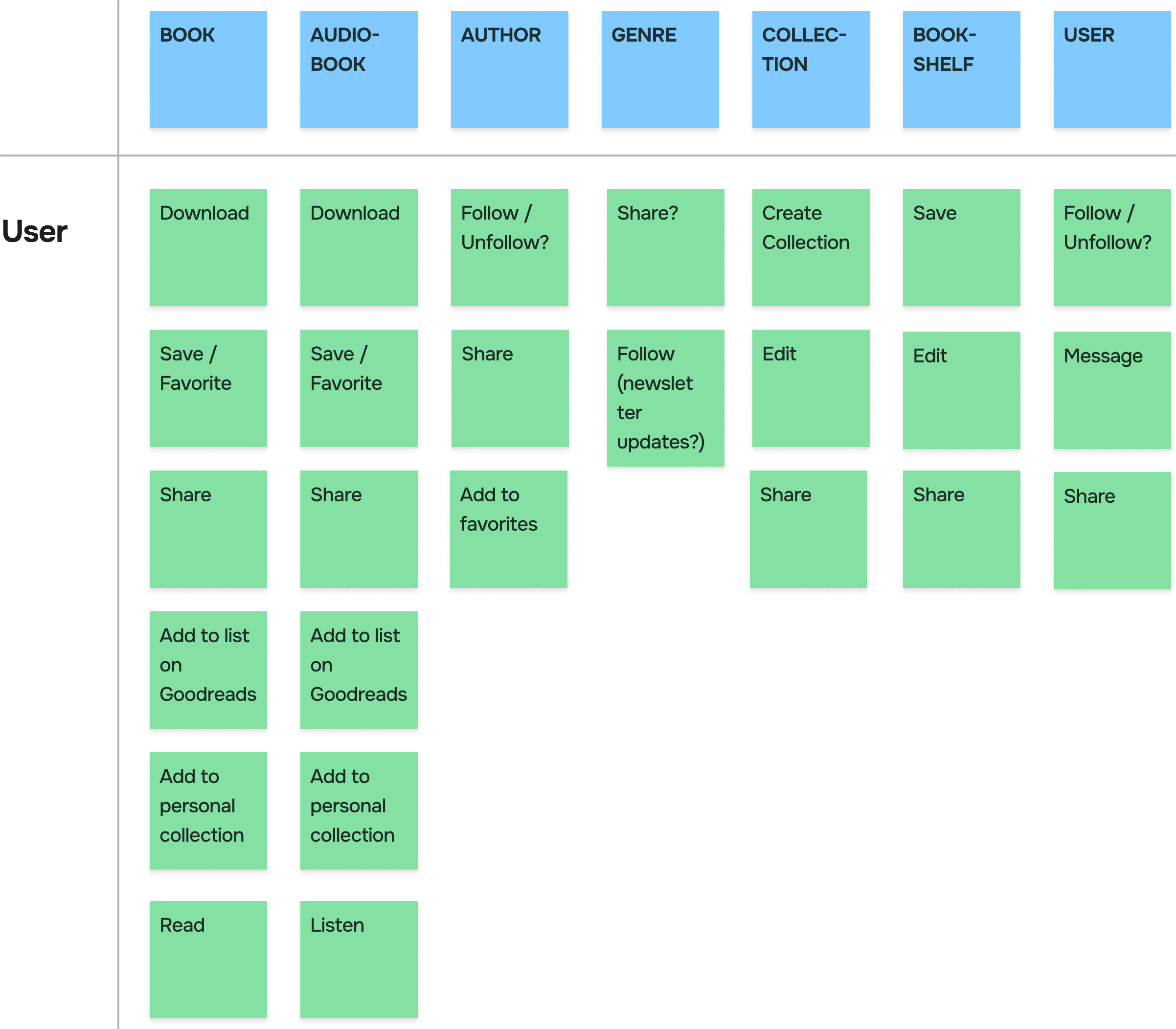
After, I built a call-to-action (CTA) matrix to define the actions users could take with each object, such as saving books to a personal list, browsing by genre or collection, and exploring related authors. This helped ensure that every object provided meaningful interactions aligned with user goals.
The CTA matrix
Attribute Discovery
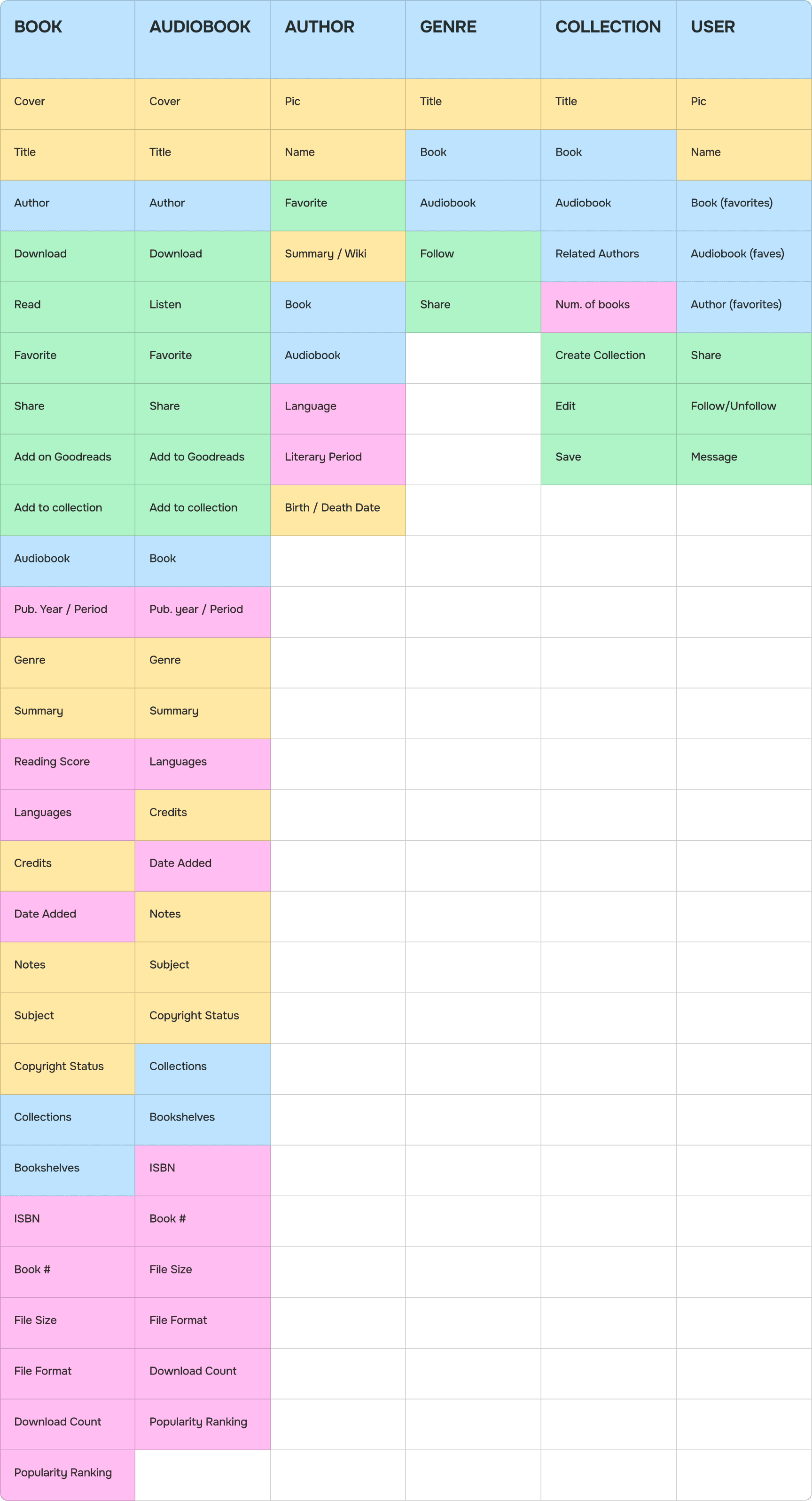
Finally, I created a prioritized object map to determine the hierarchy and importance of each object on the site. This helped me focus on the most essential elements, like books and genres, while ensuring secondary objects, like collections and users, supported the overall experience.
Cropped image of the prioritized object map, which streamlined the transition to component design in Figma.
Prioritization
Additionally, I removed “bookshelves” to instead focus on collections and tags (new object). This choice simplified the categorization system by eliminating redundancy, as bookshelves often overlapped with collections.
I also removed the “user” object.
One of the best things about Project Gutenberg is that you do not need an account. A user account would have its perks, but I left it for a future iteration. Readers can still save books to their "Want to Read" list on the popular book-tracking website Goodreads, directly from each book's page using the integrated Goodreads button.

For the redesign, I focused on books, authors, and collections.
Representation
Wireframing the Main Objects
After creating the prioritized object map, I wireframed variations of each main object. This ensured that the most important objects, like books and authors, had clear interactions and were visually prioritized in the design.

A sample of objects I wireframed to find out what they looked like and what information different versions would include.
Combining and Nesting Objects
I used the OOUX principle of combining and nesting objects, creating a more consistent interface. This approach prevents objects from changing unpredictably across different contexts, ensuring clear relationships and shared structures.

I brainstormed how the main objects would look and what information different versions would include.
User Flows
Book Discovery and Download Flow

High-level user flow showing how users discover books by using the search bar or selecting “browse” on the navigation bar, then proceeding to the download page.
Donation Task Flow

After downloading a book, users are prompted to make a donation. They begin by selecting an amount, adding an optional comment, and completing payment through a secure third-party platform.
High Fidelity
After creating a visual representation of each object using color-coding from OOUX, I made wireframes in black and white to get a firmer grasp on the shape of each object, and the information hierarchy therein.

The evolution from color-coded OOUX wireframes to the polished, final designs.

Additional Enhancements
Better Donations
To encourage more donations, I introduced a donation prompt immediately after the book download.
The goal was to make donating intuitive and impactful without disrupting the user’s journey. This approach leverages principles of reciprocity and timing:
Reciprocity: Users are more likely to give back when they feel they’ve received something valuable
Timing: Prompting donations right after the download maximizes attention, as users are already engaged with the site.

Loading
Better Book Discovery
The browsing experience was redesigned to make discovering books more intuitive and engaging. By introducing clear categories like fiction, non-fiction, collections, and tags, users can easily explore books based on their interests.

The new "browse" menu allows users to discover books by genre, collection, period, or trending tags.
Better Mobile Experience
According to SimilarWeb, 51% of visitors access Project Gutenberg on a mobile device, surpassing desktop users.
Recognizing this shift, I prioritized creating a mobile-friendly version of the site to ensure a seamless experience across all devices.

From SimilarWeb.
Before / After Gallery
Desktop
Mobile
(Interactive)
Takeaways
Impact
●
Applied strategic donation prompts to increase donations to the organization.
●
Created a mobile version of the website.
●
Simplified navigation and improved discoverability to encourage users to explore more books.
●
Generated a new design for all 4 key pages: home, author, book, and search.
Future Iterations
●
The ability to create an account and create collections that can be shared with others.
●
A discussion section on the book's page.
●
A better experience for users who want to read directly from their browser.
●
Offline reading features.
Key Insights
Leveraging OOUX: Object-Oriented UX was invaluable in simplifying complexity by focusing on core objects. It ensured consistent and predictable navigation.
Strategic Prompting: Adding donation prompts at the right moment, such as after downloads, shows how timing and context can influence user behavior.
Iterative Problem Solving: Breaking elements into reusable objects reinforced the value of maintaining consistency across the website.
Prioritizing Key Flows: Designing user and task flows highlighted the importance of focusing on core journeys, like finding books and donating.


